01
Municipalities & Organizations

The primary audience. Looking for professional partnerships, structured programs, and clear evidence of experience.
“I need to see what programs are actually being implemented and what they achieve in practice.”
Kesher Ben Dori is a nonprofit bringing preschoolers and seniors together to build close intergenerational relationships and improve quality of life.
Conversations with a founder helped me identify three distinct audiences whose different needs weren’t reflected in the website. My challenge was to give each a clear way forward.
Kesher Ben Dori is a nonprofit connecting preschoolers and seniors.
A founder interview revealed three audiences whose needs weren’t reflected in the website. My challenge was to give each a clear path.
UX/UI Designer · Website Copywriting

I spoke with Sharon, one of the founders of Kesher Ben Dori, about who the website needed to reach.
From the founder interview
“Heads of education departments, people working in municipal welfare, education, and social services.”
“Anyone, including me as a parent, could go to my daughter’s school and suggest the Kesher Ben Dori program.”
The interview notes also mention initiatives from kindergarten teachers and owners.
Sharon, co-founder of Kesher Ben Dori · Translated from Hebrew
Design question
Sharon helped me identify who the site needed to reach. I wanted to find out what those audiences had in common and where their needs differed.
The starting point
Build public visibility and strategic partnerships.
Municipalities, organizations, and business partners
Education professionals Parents & local initiators
User Interviews
The conversations focused on their goals, concerns and expectations of the website.
The primary audience. Looking for professional partnerships, structured programs, and clear evidence of experience.
“I need to see what programs are actually being implemented and what they achieve in practice.”
Kindergarten educators seeking suitable activities, guidance, and reassurance about safety and insurance.
“I need to trust the organization and know that insurance and safety are clearly covered.”

Individuals with an idea, often needing partners, guidance, and structure to move forward.
“I understood what the organization does, but I wasn’t sure what I should do.”
Key Insight
The interviews surfaced three different information needs: evidence of programs and outcomes, reassurance about safety, and clear guidance on what to do next.
Content Audit
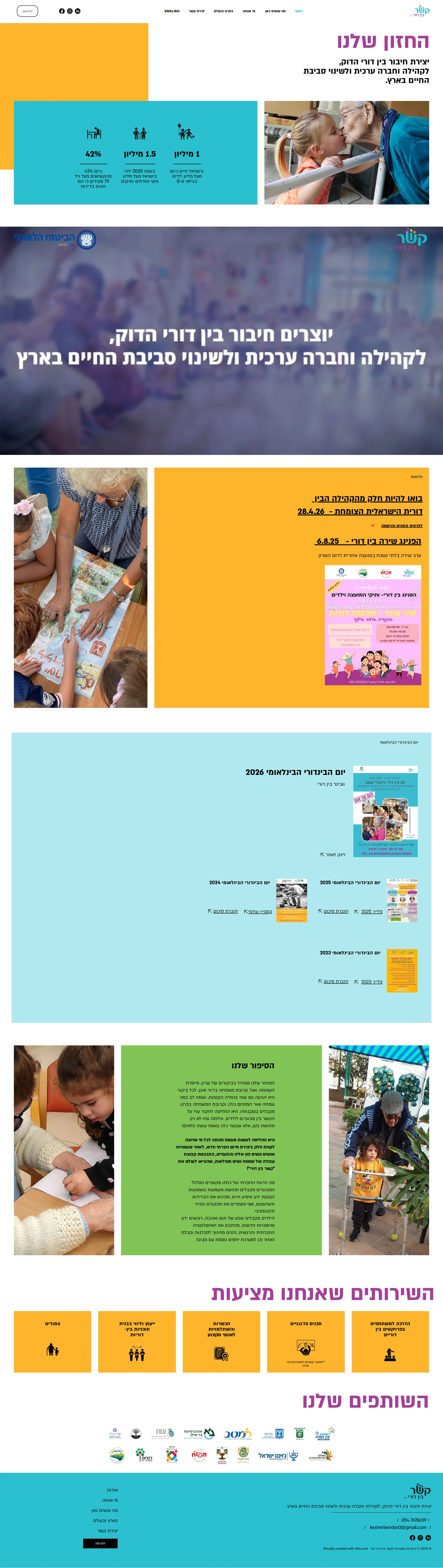
I used the interviews to assess what the homepage already supported, what was worth preserving, and where it fell short.
Mission statement
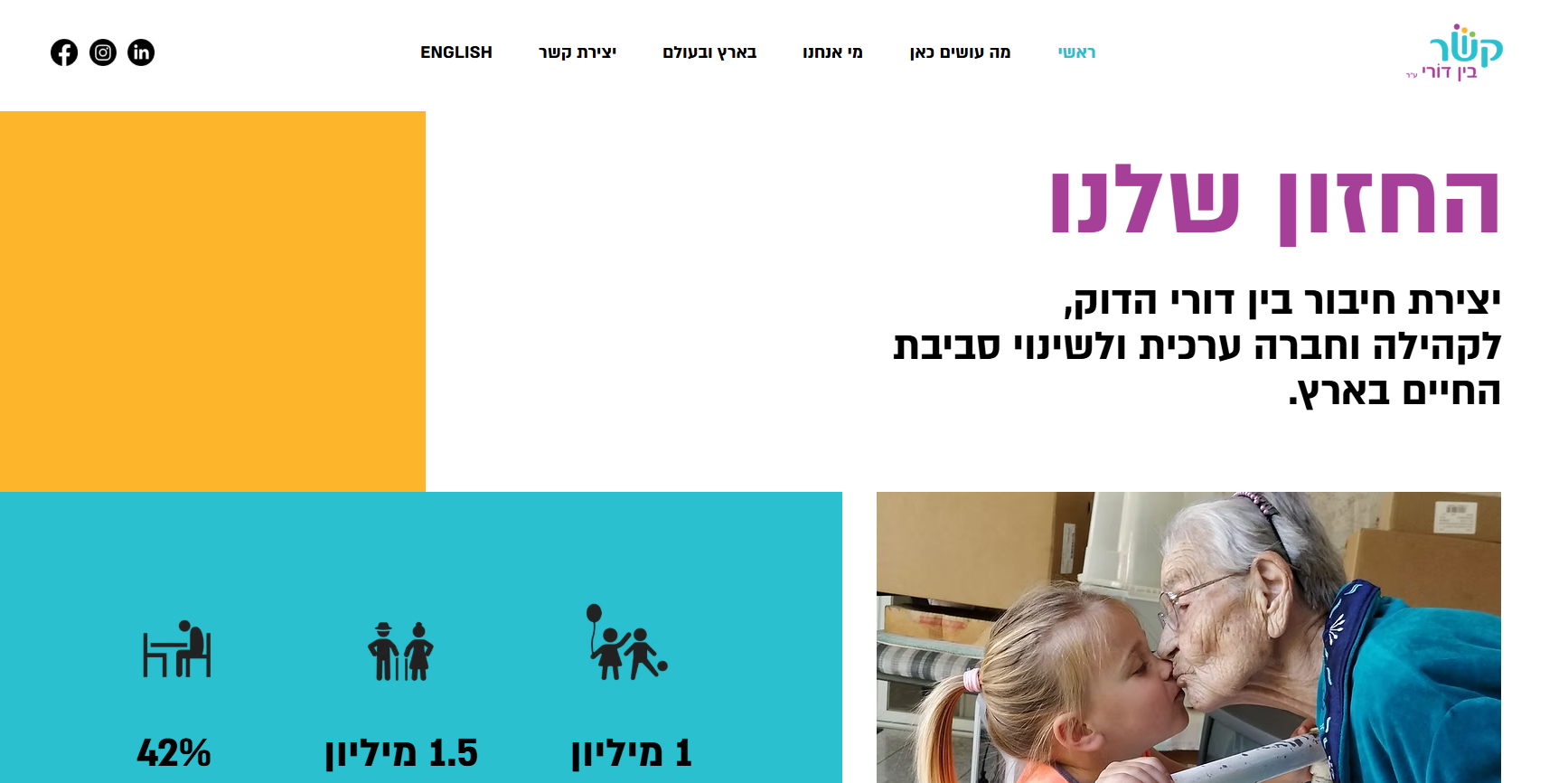
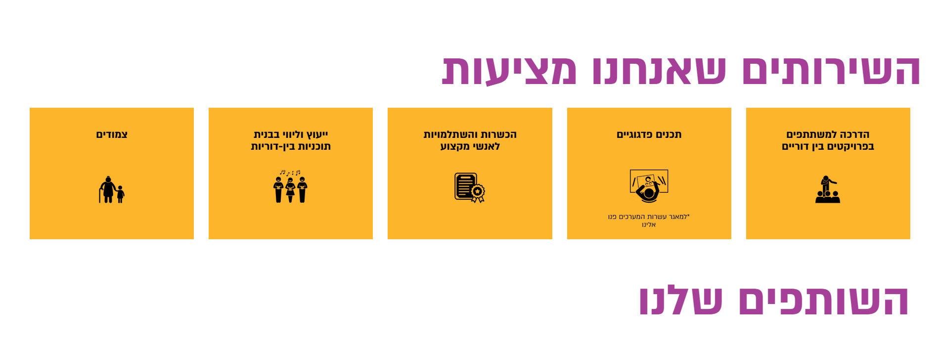
The organization’s core services appeared near the bottom, putting essential information at risk of being overlooked.
Want to see my design solution?Jump to the redesign
Content Structure
Looking at the page as a whole, I found that its structure gave little priority to the organization’s goals or the different questions its audiences brought.
01
Sections followed one another without building a clear understanding of the offering or its relevance to each audience.
02
Videos, updates, background information and services competed for attention without a clear hierarchy.
03
Visitors had to open separate navigation pages to piece together the organization’s activities, credibility and opportunities to get involved.

Usability Testing
In a usability test with the Parents & Local Initiators participant, I observed how the search for relevant information led him away from the homepage and through the navigation.
Homepage
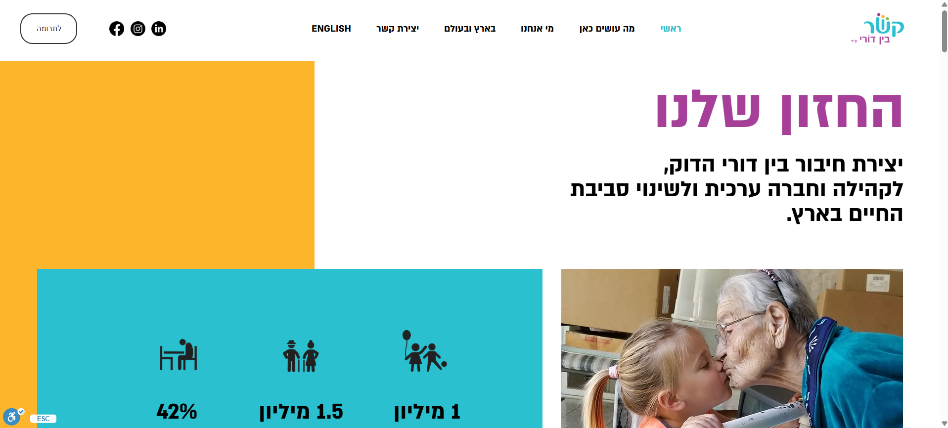
He leaves the homepage to look for more relevant information.
What We Do
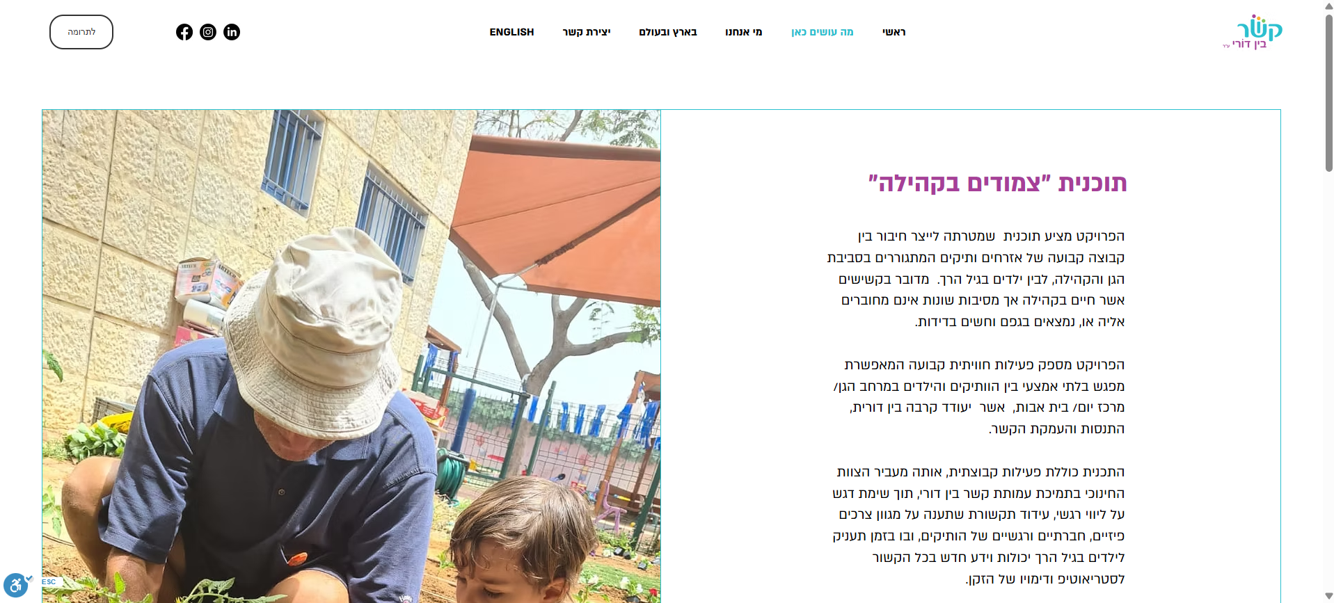
The activities become clearer, but how to get involved remains unclear.
About Us
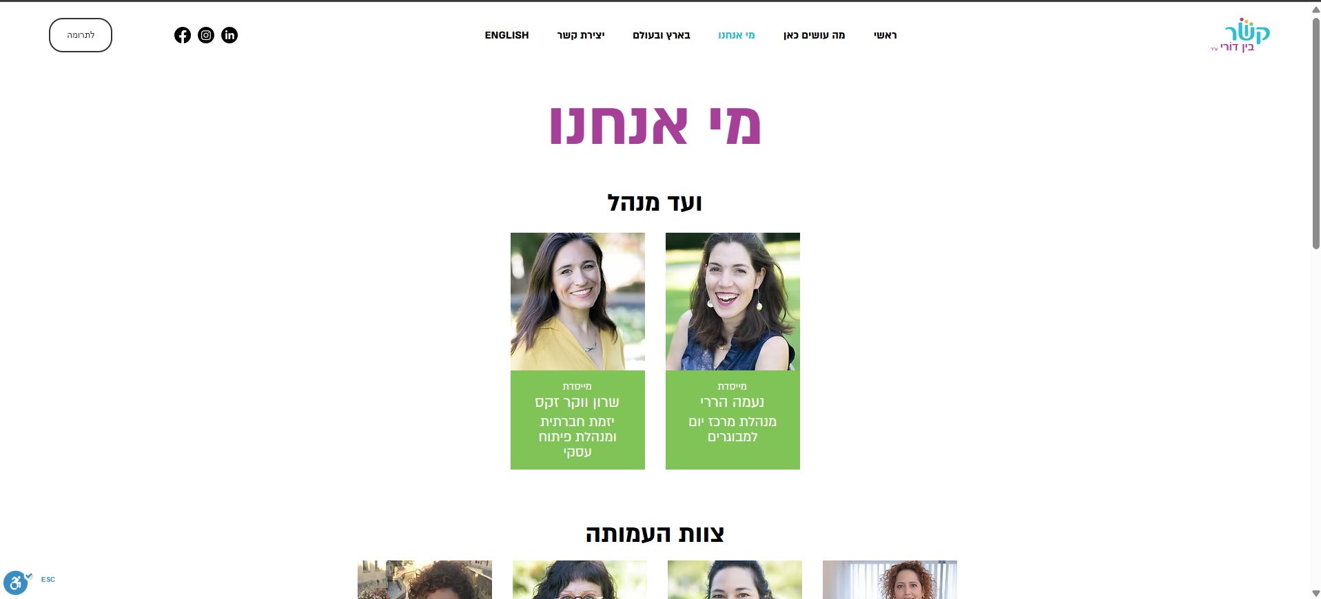
He visits another page to learn more about the organization.
In Israel & Abroad
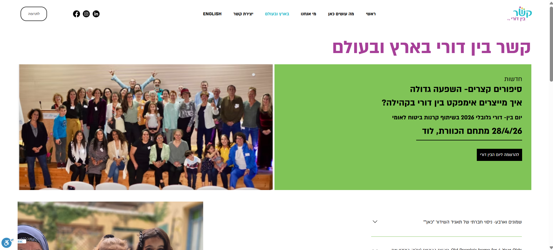
He keeps browsing for information that could help him move forward.
Contact
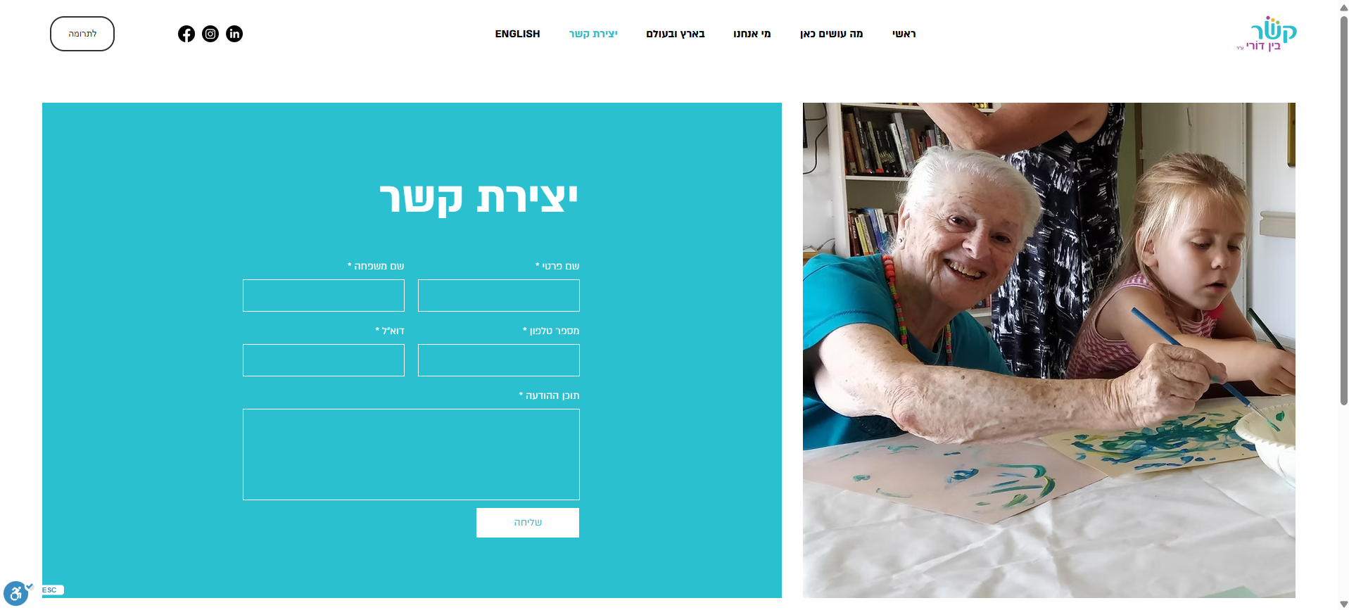
Contact becomes the endpoint of his search.
The search continued beyond the homepage
User Paths
The research suggested that each audience needed a different route through the site, while users who were not ready to choose still needed a clear way to keep exploring.
Final Homepage
Instead of asking users to figure out where to go, the homepage made the available paths visible and easy to compare.
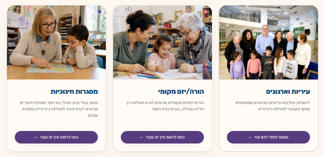
Audience label
and imagery
Tailored message
Dedicated action
HOMEPAGE HIERARCHY
Partner logos and testimonials establish credibility. Activity images show the initiative in practice, while FAQs address practical questions before the closing call to action.
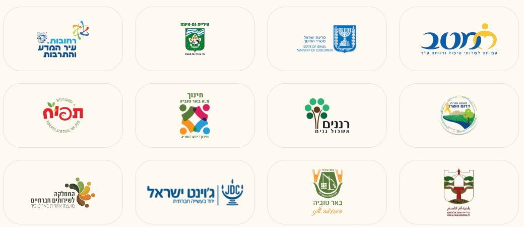
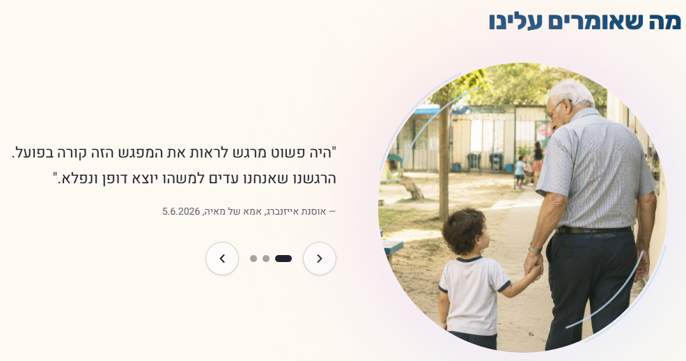
Build trust and
reinforce credibility
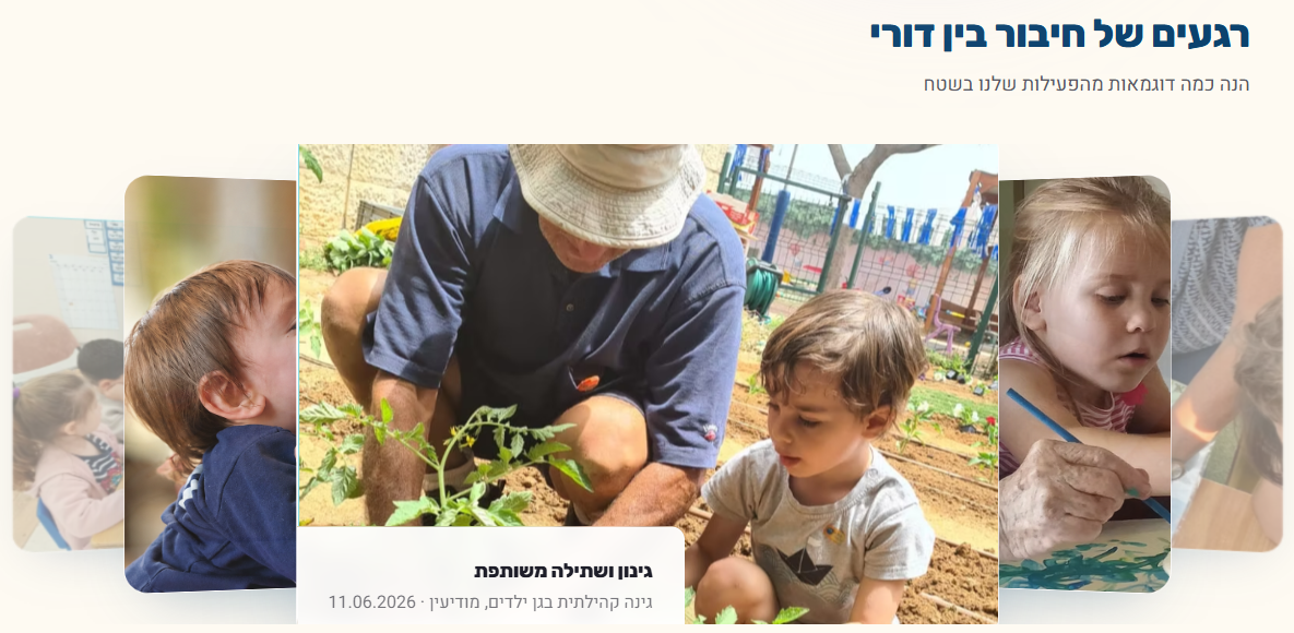
Spark interest
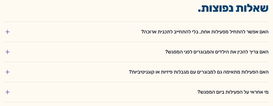
Address practical
questions
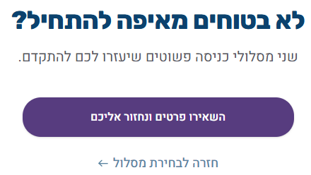
Lead to action
AUDIENCE ADAPTATION
I kept a shared visual system across the audience pages, while adapting the content to their needs. In the testimonial sections, that meant changing the message and imagery to offer relevant reassurance.
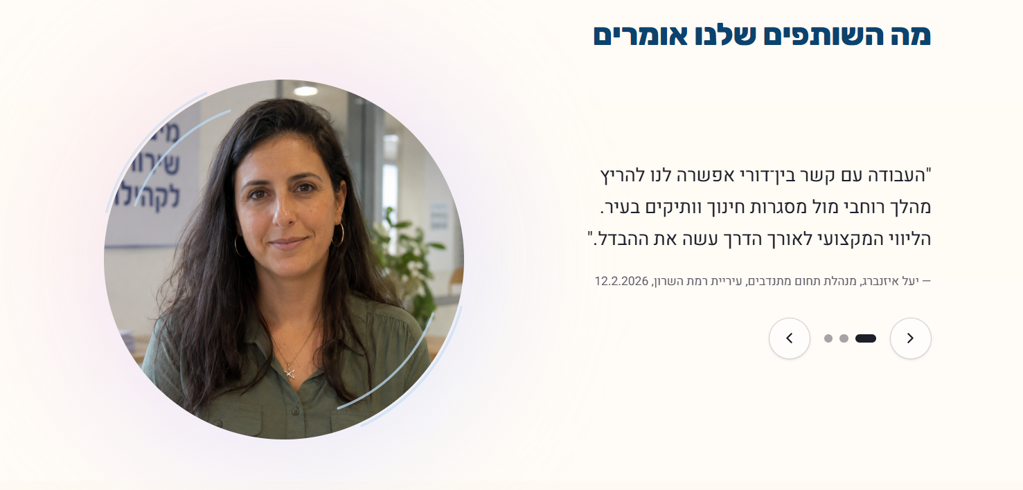
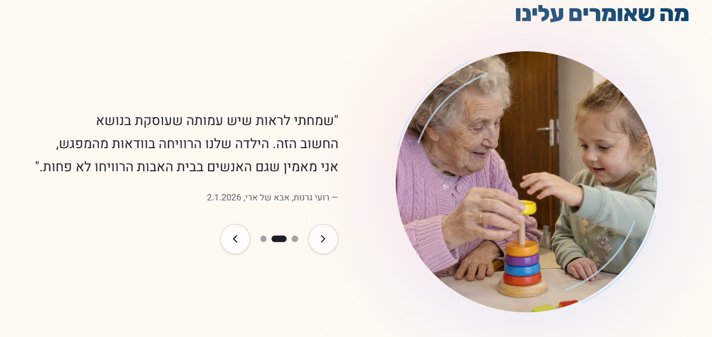
Page-specific CTAs
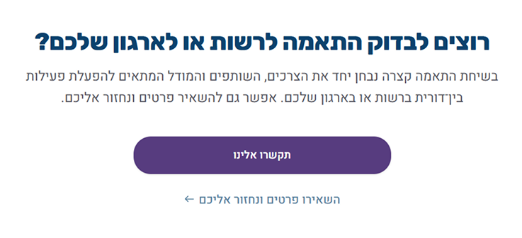
I adapted the CTA copy and the available actions to each page. On the homepage, I offered help getting started. For parents, I made it clear how to call, request a callback, or read more. For organizations, I invited a conversation about what a partnership could look like.
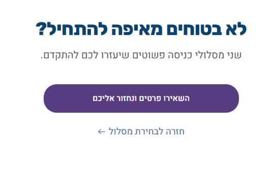
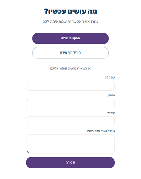
From Design to Build
Using AI-assisted development in Lovable, I turned the research and design into a working website, carrying the project through to implementation.
For a small organization, that can mean fewer handoffs and a shorter path from design to launch.
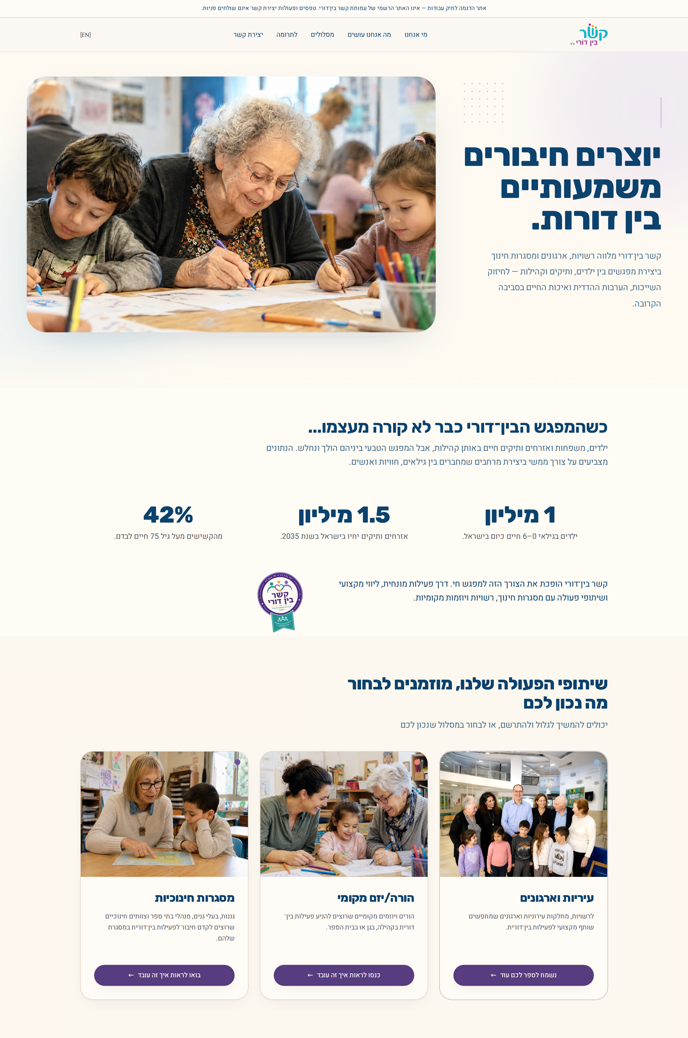
Not the NGO’s official website. Some links are inactive because they fall outside the scope of this prototype.
Design Workflow
I used design and AI tools to support research, develop the visual language, and build and refine the website.