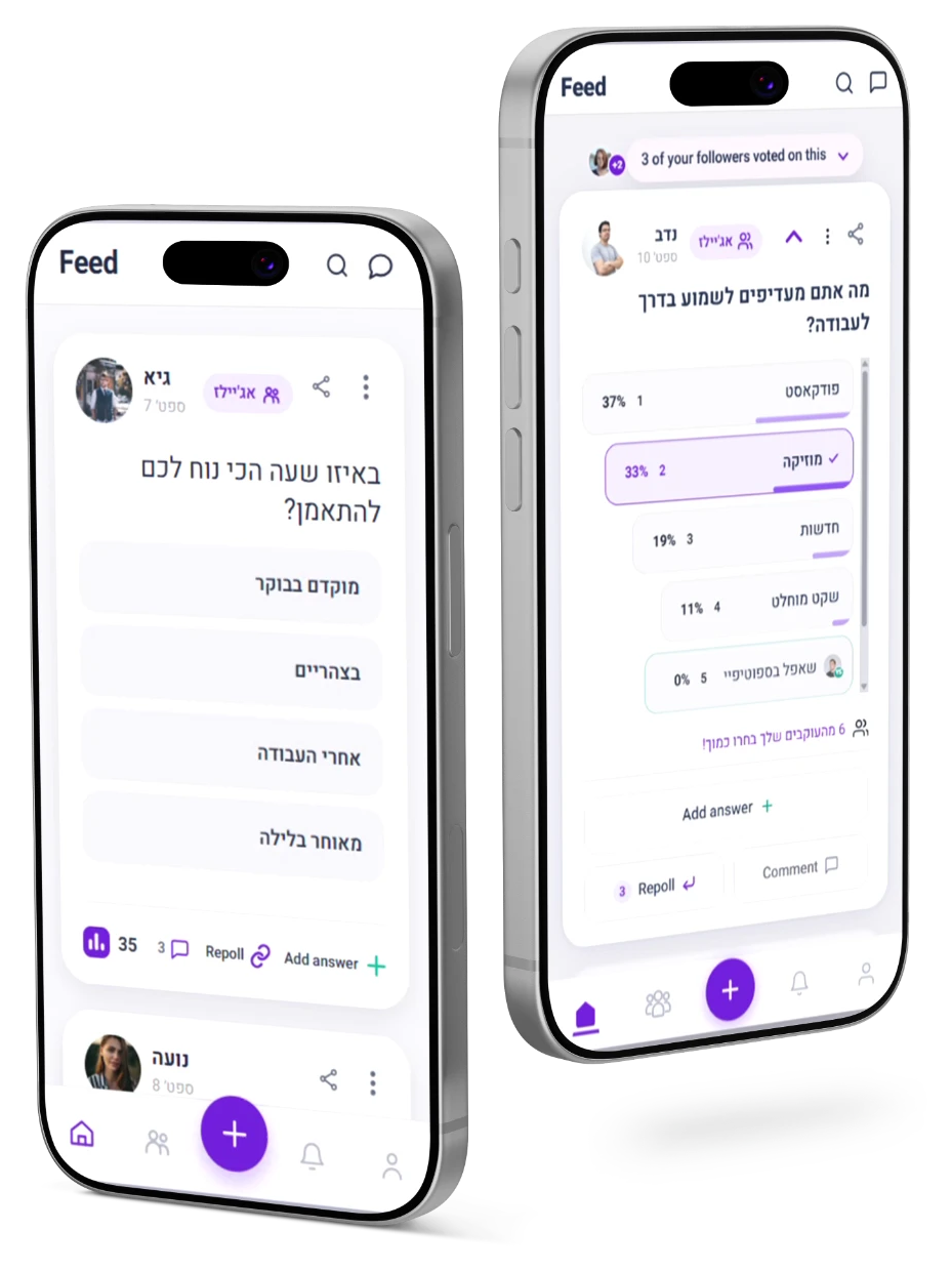
Polz’s feed needed to make
participation
clear—and inviting.

Polz is a social network where users share opinions through polls. Its feed offers more than voting, but unfamiliar controls and hidden actions made those possibilities difficult for new users to discover.

My challenge was to make the feed easier to understand and give users a reason to keep exploring it—discovering what they could do and finding more ways to participate.

Polz is a social polling app where actions beyond voting were hard to discover. I explored two feed prototypes to make those actions clearer and encourage participation.

MY ROLE
UX research & analysis · UX/UI · UX Writing · Prototyping
TOOLS
Figma · Photoshop · Figma Make · ChatGPT

THE STARTING POINT

Three priorities shaped the feed redesign.

01

Make participation easier to discover

Make actions recognisable and keep follow-up contributions within reach.

02

Keep attention on each question

Reduce competing controls and acknowledge each vote with clear feedback.

03

Give each choice more meaning

Make results easier to compare and connect choices to other users.

I explored these priorities through two different feed prototypes.
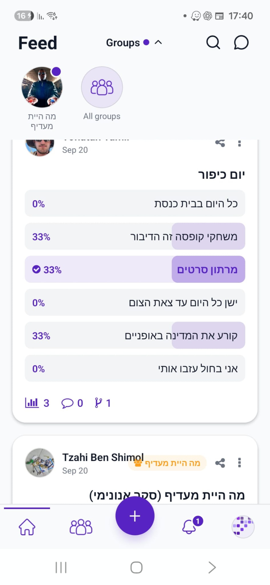
The original Polz feed: a poll card with answer bars and small unlabelled icons for results, comments and follow-up polls
ORIGINAL POLZ FEED

DESIGN EXPLORATION

Two prototypes. Two approaches to participation.

Prototype 1

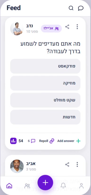
Prototype 1 Polz feed before voting, with a labeled action row showing Repoll and Add answer

Clear, visible actions

Make the available ways to participate clear from the start, so users can see what they can do beyond voting.

Prototype 2

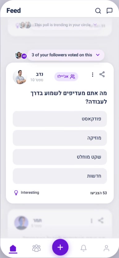
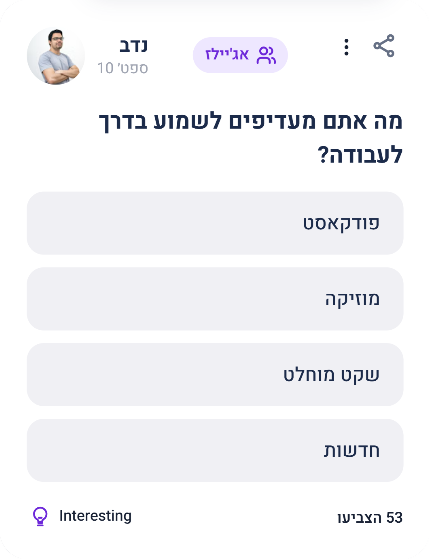
Prototype 2 Polz feed before voting: a focused poll card with a social hook, faded neighboring cards and an Interesting row

Focus, feedback and discovery

Keep attention on one poll, respond to the user’s choice, and reveal more ways to participate after voting.

ORIGINAL INTERFACE

MY PROPOSAL

Original Polz action bar with three icon-only controls

New users struggled to interpret the feed’s small, unlabelled icons. The available actions were easy to miss.

I made the action row easier to scan with larger icons and short UI copy. Labels like “Repoll” and “Add answer” tell users what they can do right on the poll card.

Prototype 1

Make the next action visible.

New users struggled to interpret the feed’s small, unlabelled icons. The available actions were easy to miss.

A more prominent action row

I made the action row easier to scan with larger icons and short UI copy. Labels like “Repoll” and “Add answer” tell users what they can do right on the poll card.

PROTOTYPE 1

A shorter path to participation.

Choosing to create a follow-up poll or add an answer required three taps.I brought both entry points directly onto the poll card.

ORIGINAL INTERFACE

Original feed poll with small Repolls branch icon
1Open Repolls
Original Repolls screen with Add a repoll button
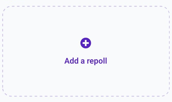
2Add a repoll
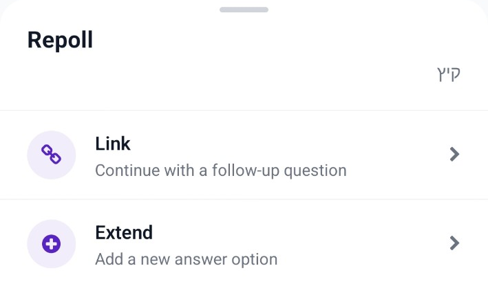
Original Repoll bottom sheet with Link and Extend choices
3Choose Link or Extend

MY PROPOSAL

Choose Repoll or Add answerdirectly on the poll card.

Prototype 1

More answers. One set of choices.

Limited space allowed only one added answer. Placed outside the original options, it looked like a different kind of control.

Making room—and creating connections

I brought added answers into a scrollable list, with visual cues linking each contribution to the Add answer action and the user behind it.

ORIGINAL INTERFACE

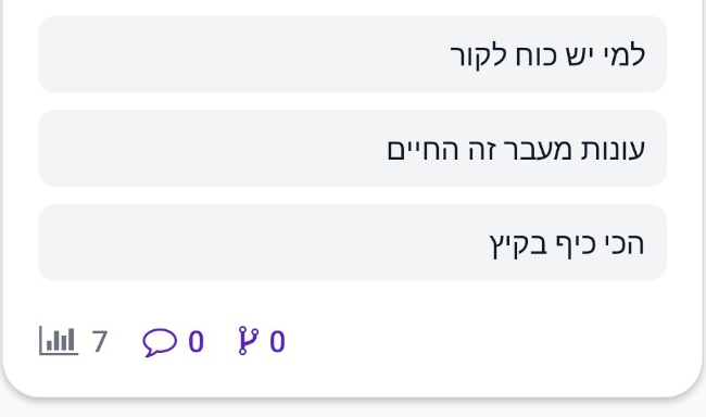
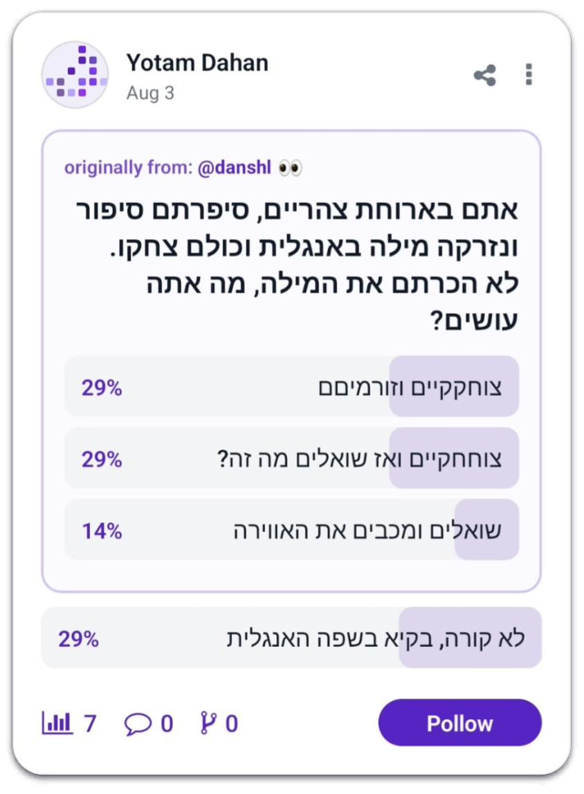
Original Polz answers: three options inside the answer group and one added answer placed separately below it

Limited room to contribute

Space constraints allowed only one added answer.

Outside the answer group

Its separate placement made it look like a different type of control.

MY PROPOSAL

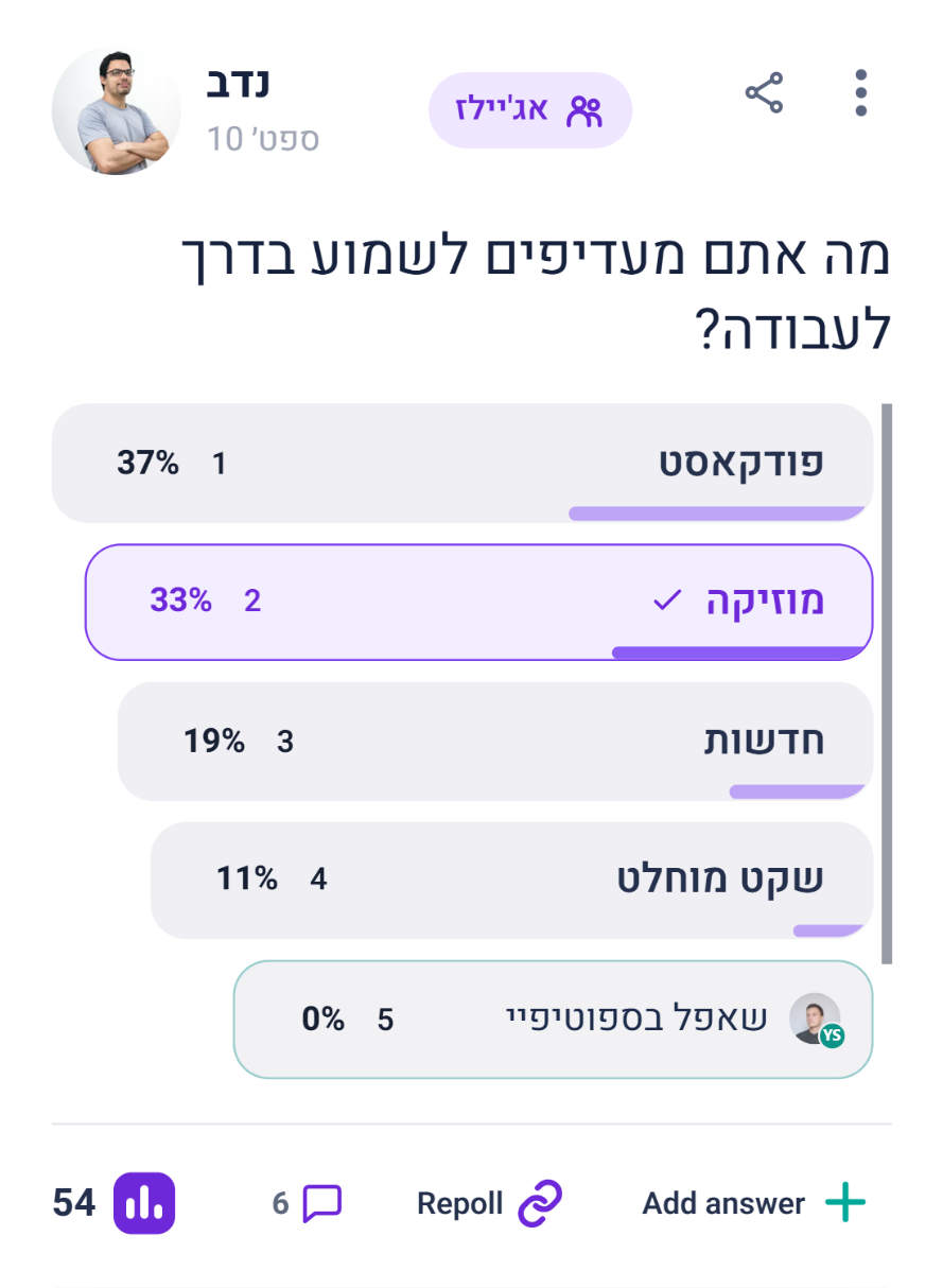
Prototype 1 answers: a scrollable list with an added fifth answer outlined in turquoise with its contributor's avatar, above the action bar with Add answer

More answers, one compact list

Scrolling makes room for additional contributions.

Connected to the action and the contributor

The turquoise outline echoes the Add answer icon. The avatar identifies the contributor, adding social context.

Prototype 2

Give each poll a moment of focus.

I kept the question in focus by holding back secondary action icons. Social cues and the vote count make the feed more engaging, while the “Interesting” action, marked by a lightbulb icon, lets users express interest before voting.

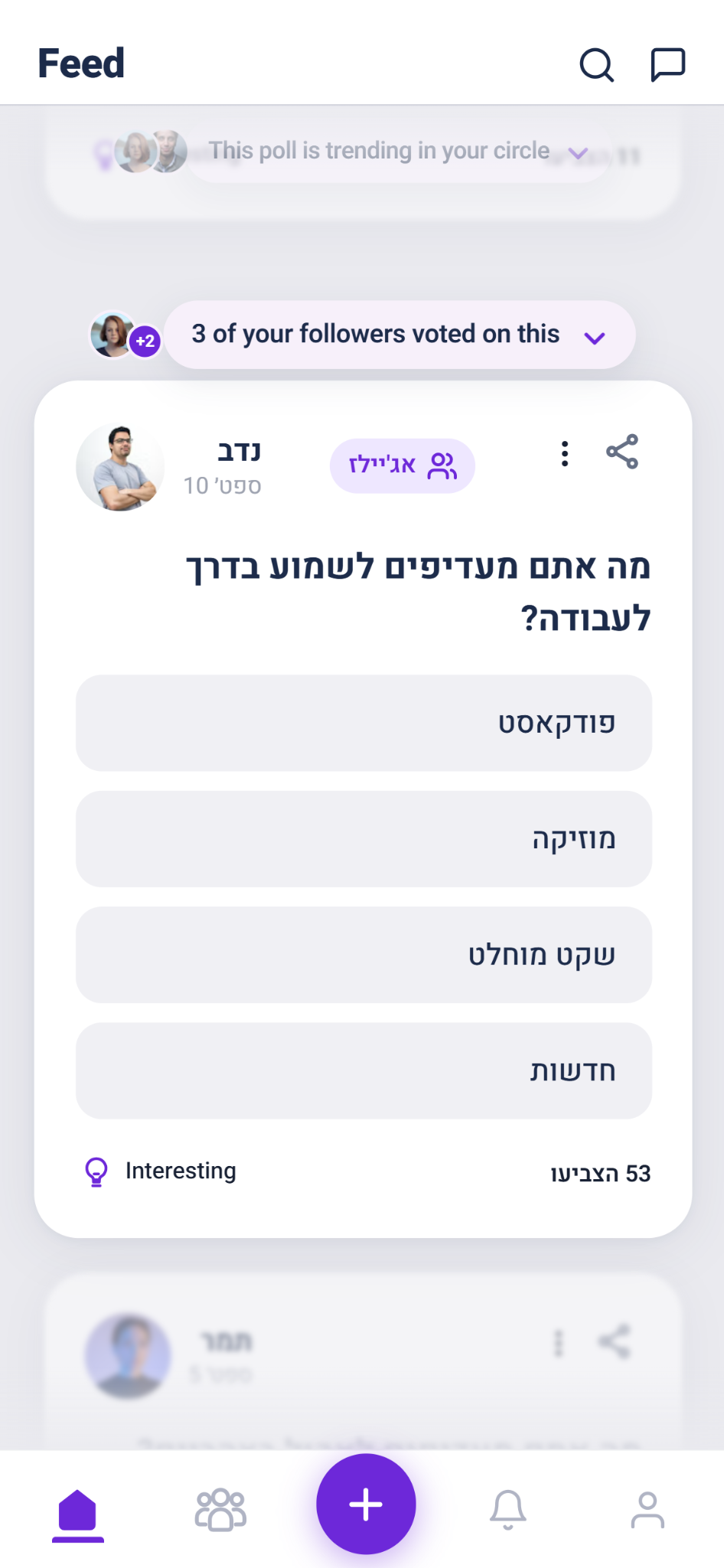
Prototype 2 Polz feed: the central poll card in focus while neighboring cards fade
One poll in focus.
Social hook: 3 of your followers voted on this
A social cueConnects the poll to people the user follows.
Interesting
Interest before votingA low-effort way to express interest before voting.
53 הצביעו
Visible participationShows how many people have already voted.

Prototype 2

Make participation feel responsive.

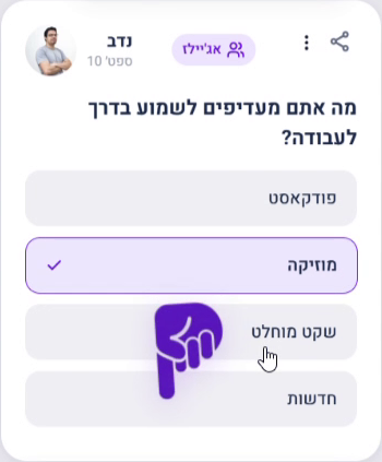
A marked answer and a short animation acknowledge the vote. The card then reveals results, social context, and ways to take part.

Reveal actions at the right moment

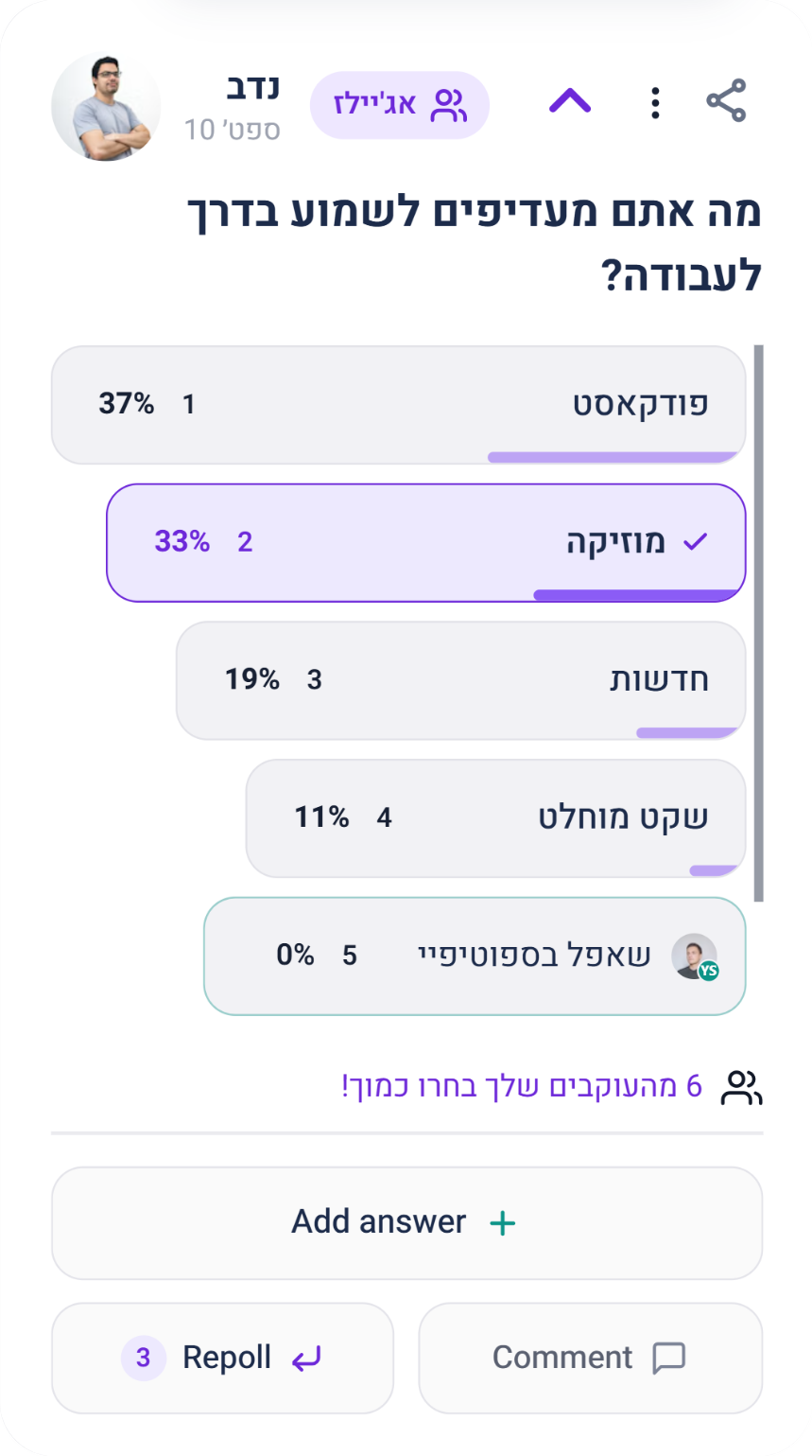
In keeping with Prototype 2’s approach, follow-up actions are revealed when the card expands after voting: Add answer, Repoll, and Comment.

01Choose an answer
Prototype 2 poll card before voting, showing four answer options
02Receive feedback
Poll card right after voting: the chosen answer is marked and a playful hand animation responds
03Results + next actions
Expanded poll card revealing results, social context, and the Add answer, Repoll and Comment actions

PROTOTYPE 2

See who shares your choice.

The results copy changes depending on who else chose the same answer. It can point to people the user follows, show how common their choice was, or tell them they were the only one who picked it.

Prototype 2 poll card with results revealed, ranked answers and a comparison sentence about followers
  • 12 followers voted like you
  • 6 followers chose the same answer
  • You’re the only voter who chose this answer.
  • 42% of voters chose this too

COMPARING TWO PROTOTYPE DIRECTIONS

See the difference in motion.

Hover over either phone to watch the prototype in action.

PROTOTYPE 1

Visible actions

PROTOTYPE 2

Curiosity and discovery

More ways to take part.

Through two feed prototypes, I explored how clearer actions, more focused questions and social connections could invite participation.

Each direction approaches that invitation differently, with a shared aim: helping users discover what they can do and giving them a reason to keep exploring.

NEXT TO VALIDATE

Test both prototypes with Polz users to compare how easily they find actions, understand the results, and choose what to do next.

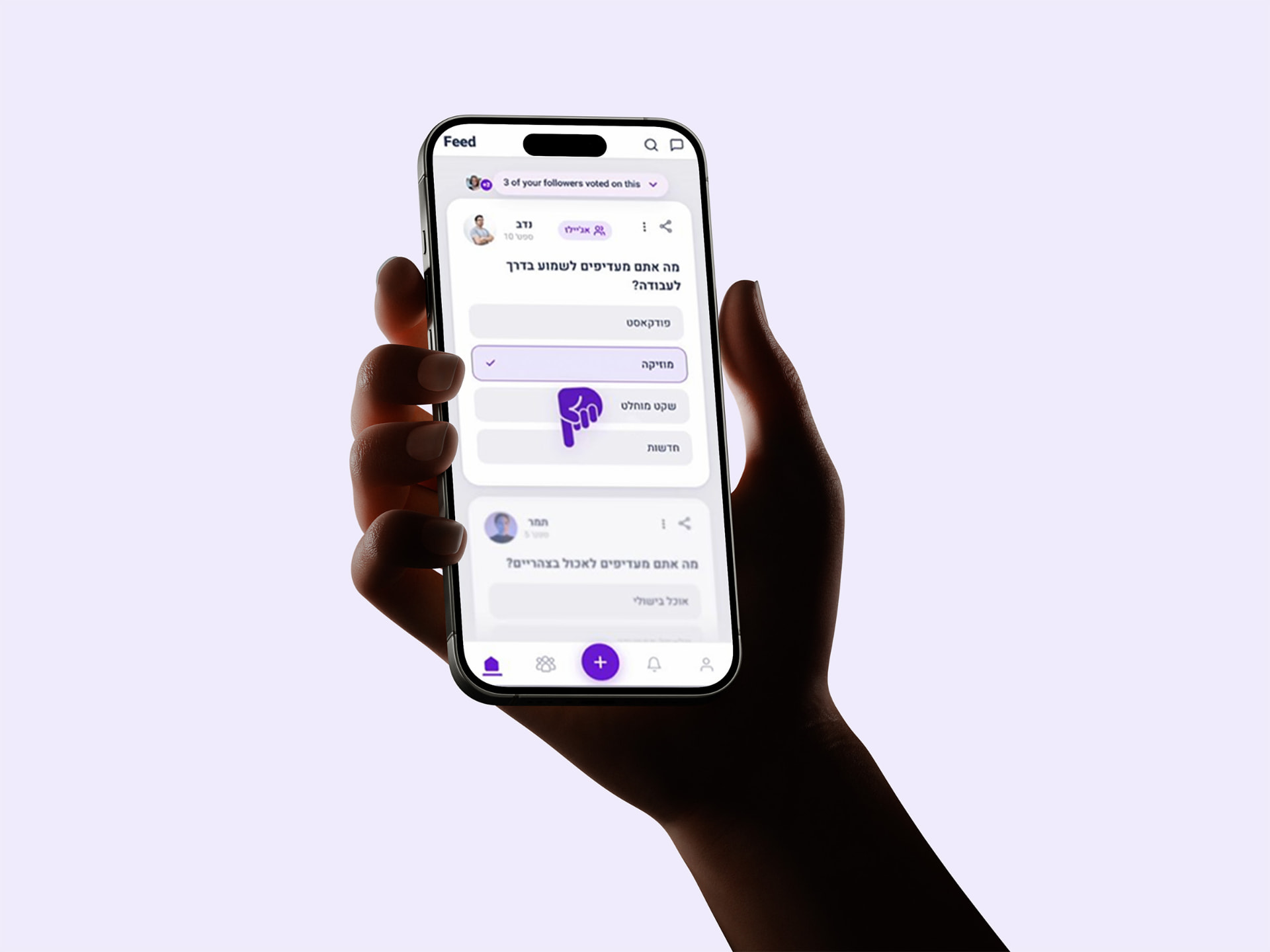
A hand holding a phone showing the completed Polz case study recap